Legora — Legal AI Scholars Program
Overview
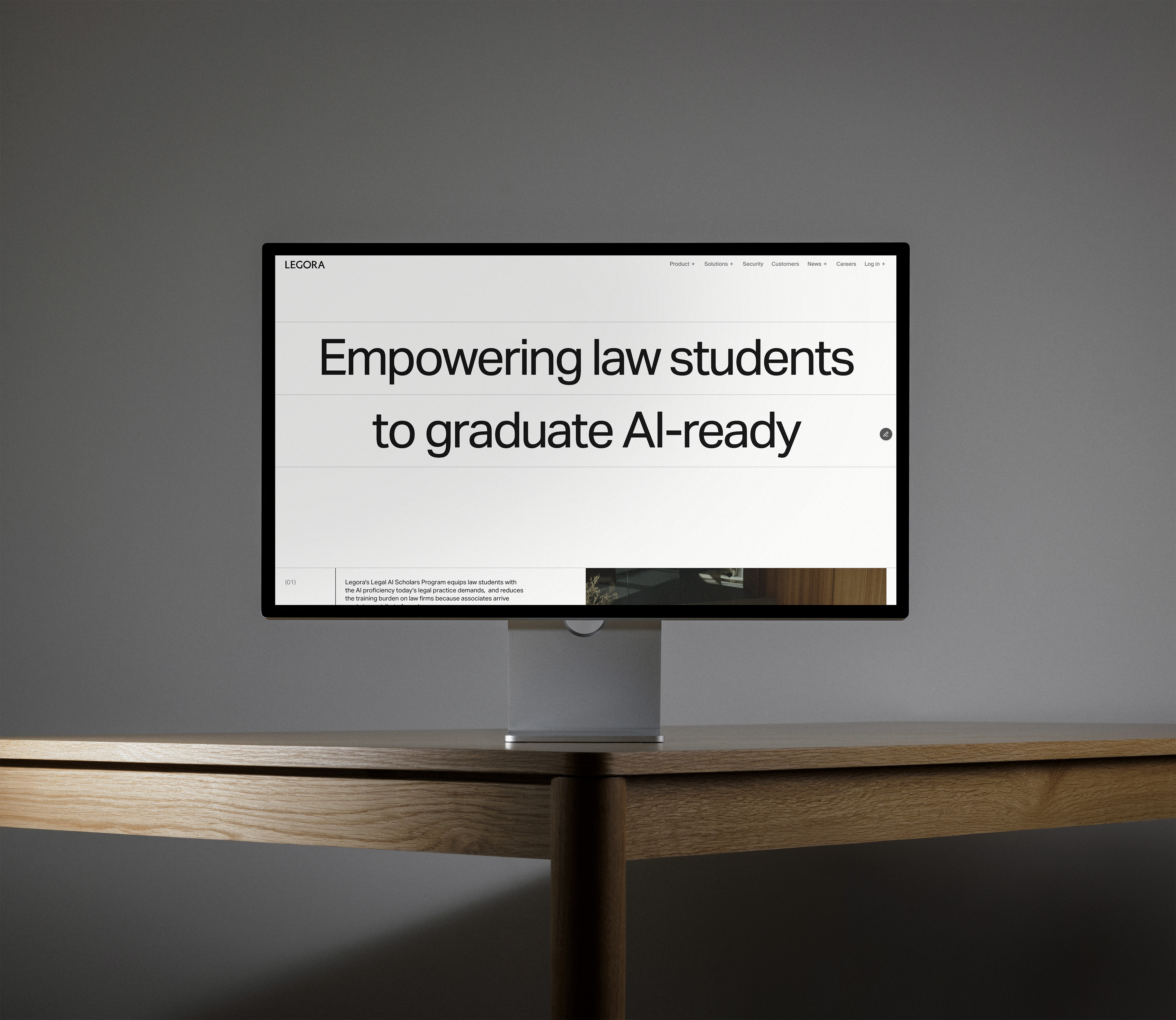
Legora partnered with G-W Studios to design a landing page for their Legal AI Scholars Program, an initiative helping law students graduate with real AI proficiency. I handled all the development in Framer, building out the full page from G-W's designs across four breakpoints: large desktop, small desktop, tablet, and mobile.
The work
Some parts of the design couldn't be achieved with Framer's native components, so I built custom ones from scratch. I created two custom slideshow components. The first was for the testimonials section, cycling through quotes from deans at various law schools. The second was for the program details section, letting users step through what the program entails in a clean, simple way. Beyond those, I also built the Manifesto section where the text transitions from gray to black as you scroll through it, and handled a line that runs down through the entire page, animating as you scroll, acting as a kind of visual thread tying the whole page together. Both the text reveal and the animated line were part of G-W's original design vision and needed custom code to execute properly.
Timeline and delivery
The whole project took around a week from receiving the designs to going live, including stakeholder meetings, content review, and the back and forth that comes with adjusting things during development. The client was happy with the result and launched it straight away. The page still live on Legora's website today.
Legora — ROI Calculator
Overview
Legora's in-house design team created a page to help law firms understand the financial impact of using their platform. The page combined research findings, key statistics, client testimonials, and an interactive ROI calculator. I developed the entire page in Framer, working across the same four breakpoints as the academic page.
The work
The centerpiece was a custom calculator component that let users input their own numbers: number of lawyers at their firm, average hourly rate, and currency. The calculator then displayed their potential additional annual revenue in real time. Beyond that, I built custom pie chart components with interactive hover states that revealed different statistics as users explored them. These charts went through several iterations on colour, spacing, and font sizing to nail the final look.
The page also featured a research report section, compelling statistics, and testimonials from Ari Kaplan and others in the legal industry, all working together to make the ROI case feel solid and credible.
Timeline and challenges
This one had a tight timeline, which meant there was quite a bit of back and forth with the design team on details — spacing, component appearance, colour schemes, the whole package. Despite the pressure, everything came together in about a week, and all the stakeholders ended up happy with the result. The page launched successfully and is live on their site.